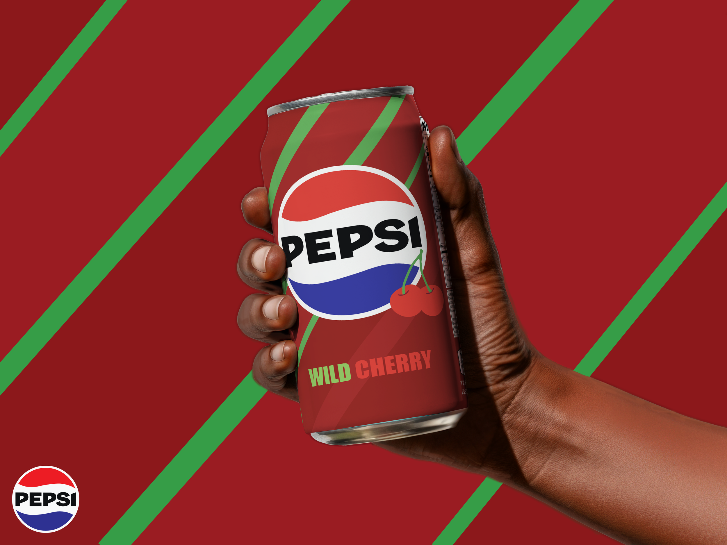
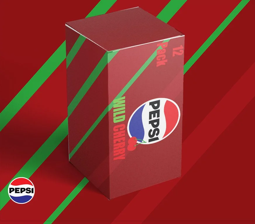
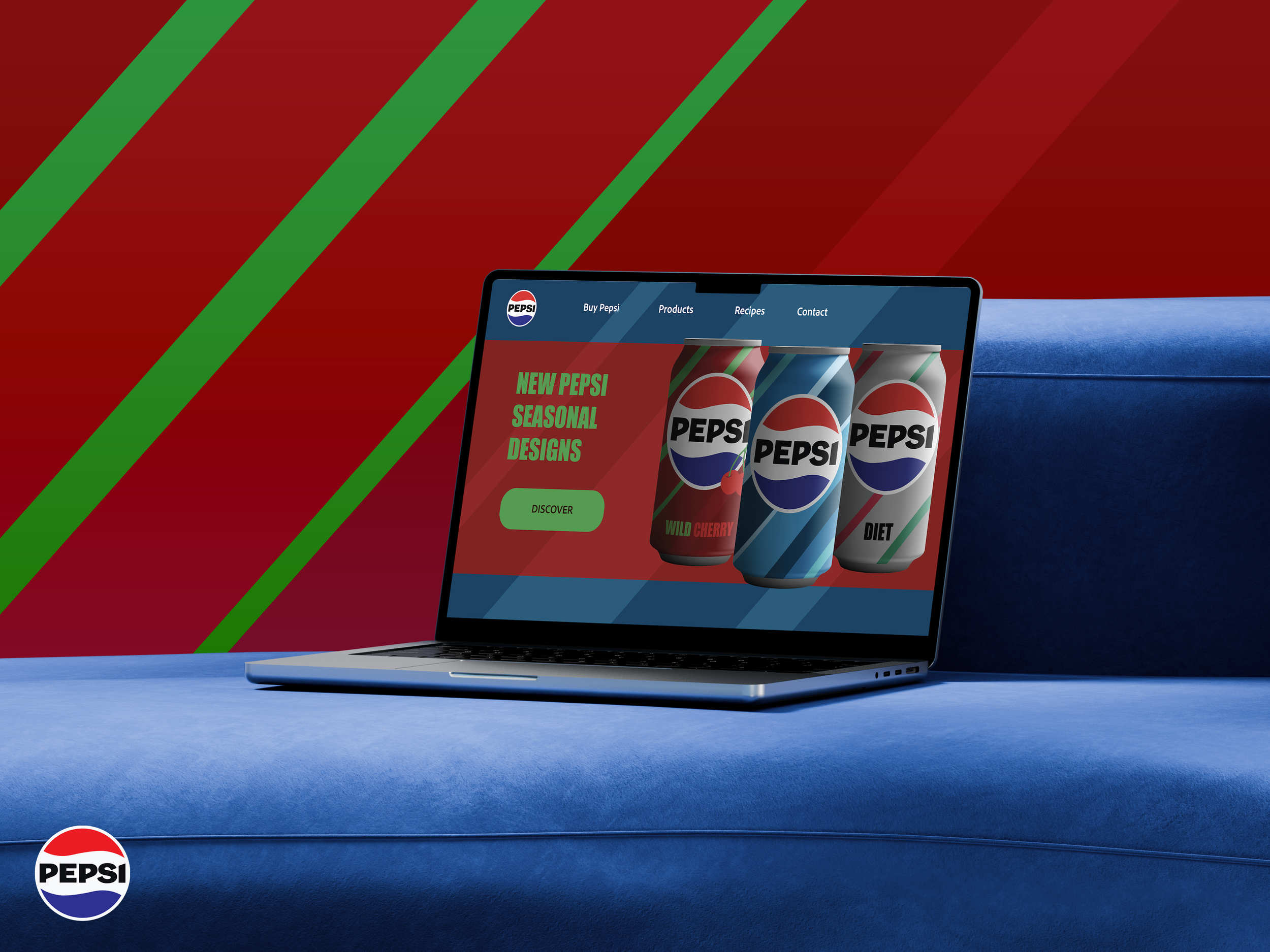
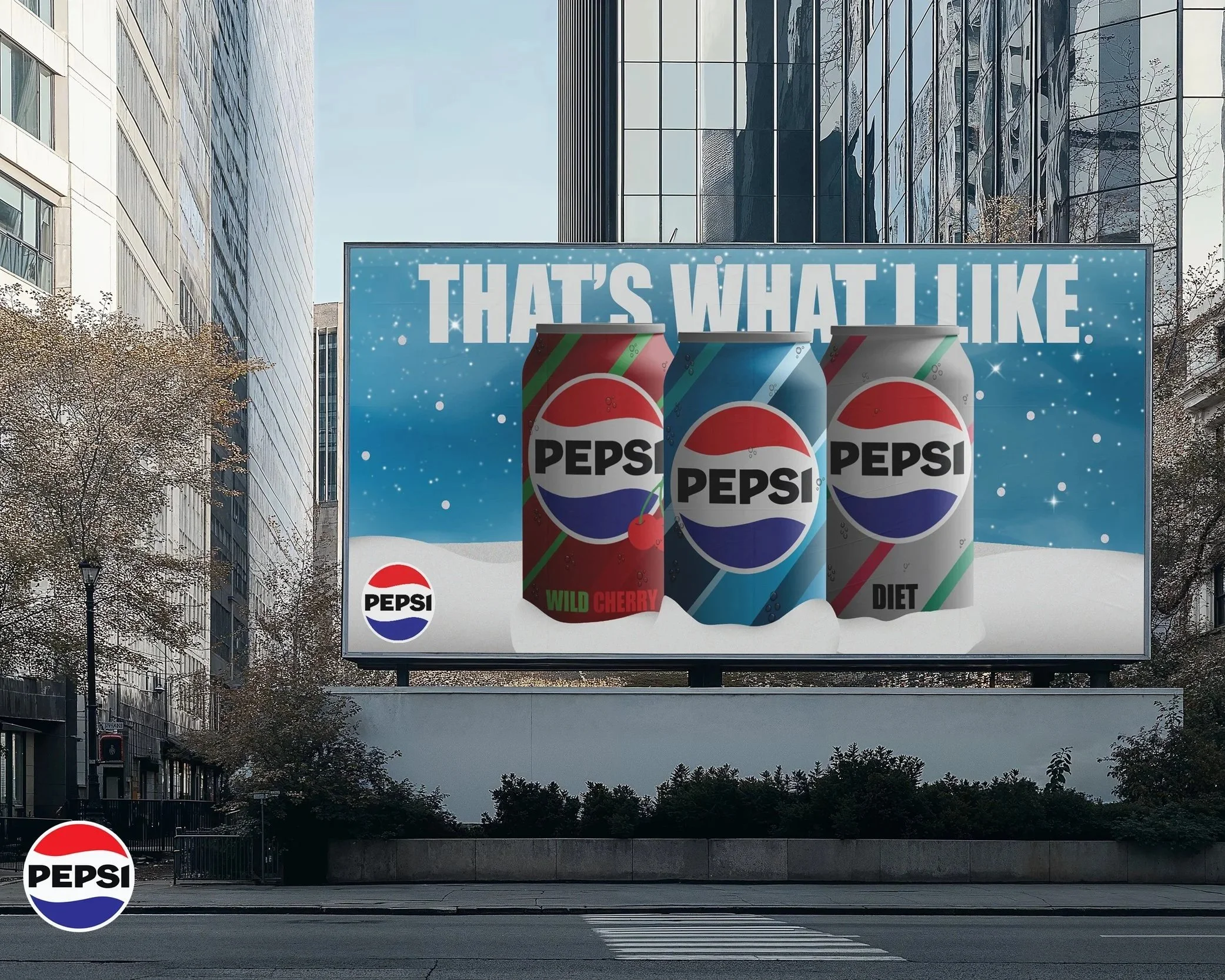
Pepsi Seasonal Design
I decided to take a more subtle approach to this redesign than in my last iteration. Instead of designing it to make it super obvious it’s supposed to be Christmas-themed, I used geometric patterns and different colors to help show what holiday it’s supposed to be. The regular Pepsi can represents a more ice/snow feel, Cherry Pepsi represents more of a present with red and green, and Diet Pepsi sports the different shades of grey, red, and green.